Nuovo Pepsi
So, this has been bothering me for a while. Pepsi started using a new font about two years ago, in 2008 and the font has always looked awfully familiar. 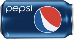
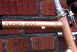
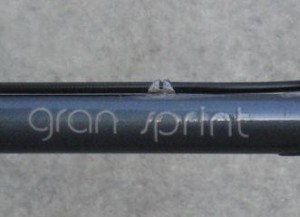
That’s because it is strangely similar to the Univega model labels. Available on univega top-tubes everywhere.
Am I crazy, is this the same font? Or is it just very similar?
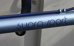
God it’s so close. They switch up the second “s” to be italicized, but the first “s” in “supra” seems so close. The top “s” loop just doesn’t hook around enough.
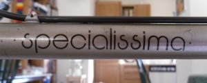
This one seems a bit too removed from the pepsi font. Maybe it is because the loops never fully close.
I need some graphic designers to help me out here. If only graphic designers rode bikes!
 1 Comment
I’m not a graphic designer, but I’ve been working closely with some over the past year and learned more about typography than I really wanted to.
None of those are *quite* the same font, but they’re in the same style. They’re modernist sans serif fonts intended to convey European elegance and sophistication.
Check out the “p” for another difference. The descender on the p is bigger on the Pepsi can, and the body of the p is a full circle on the Pepsi can, compared to the unclosed p on the bikes. The bikes also have a straight left-hand edge on the p.
The i is different too. The dot is squared off on the bikes, but round on the Pepsi can, with a matching concave top on the stroke.
It reminds me a bit of Futura: http://en.wikipedia.org/wiki/Futura_(typeface)
Aha, no wonder it reminds me Futura. The font is called “Pump Light” and it’s based on the same progenitor as Futura, a font called Bauhaus, from 1925.
Pump Light: http://www.identifont.com/show?68L
Bauhaus: http://www.identifont.com/show?6IO
The Pepsi logo is likely a hand-created one-off, and doesn’t use an actual font. It definitely captures the 1920’s futurist spirit though.