:Cyclostat
Graphing transportation, and also some stuff
 2 Comments
Blogroll
- OPEN You have to love OPEN
- Pedalstrike I have such a blog crush on this girl.
- Raised by Wolves She’s new, but I’m looking forward to her posts.
- Somerville Bikes
Tags
activism
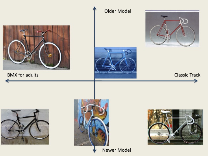
allignment chart
arousing
Balls
Bike Lanes
boston bikers
Boston Globe
chaotic guy without a shirt
critical mass
cryptic clue fest day 5
Cycling Advocacy
Cyclist
Cyclist deaths
David Byrne
Delta Airlines Bike
drivers license
Driving
Elizabeth Lambert
evil SUV
female cyclists
good
Helmets
infrastrcture
Kassidy C. Shumway
lawful
Laws
Messengers
n00bs
newbie biker
new cyclists
NYC
NYtimes
Rachel uchitel
reproduction
RFK park
Rose Fitzgerald Kennedy
safe biking
Shane
Soccer
Stop Making Sense
the 1980s
transportation allignment chart
Versus Cycling
williamsburg
women cycling
Translate

