Update on Cycling Trends
As an update from my previous Post, I’d like to first make a compariston, using the more advanced google insight. Below is a graph of cycling searches, with a relative search index number on the right. FYI, higher numbers mean more searches, but don’t necessarily denote a specific number of “googles”.
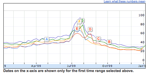
The graph shows a general trend toward a decrease in “cycling” googles, but then I looked at the yearly averages: 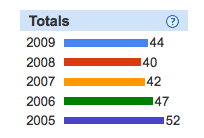
Yes, that’s right. 2009 showed a slight increase! We’re actually above the 2007 numbers, but not quite at 2006 numbers.
So, this could mean two things:
1) A decrease in the world’s interest in cycling
2) A saturation of knowledge in cycling, which is now reaching equilibrium
3) A possible upswing in cycling interest? That remains to be seen, but MAYBE.
And before anyone gets on my case for using this ridiculous measure, Google is using this to measure the fucking flu.
That’s right. Google is assuming that more people google Flu-related things during flu season and that this is indicative of Flu prevalence. We’ll see how that turns out.
Comments Off on Update on Cycling Trends

